Note
Click here to download the full example code
MGC Map
hyppo offers the hyppo.independence.MGC class, which is a powerful independence
test to fit a host of different types of data.
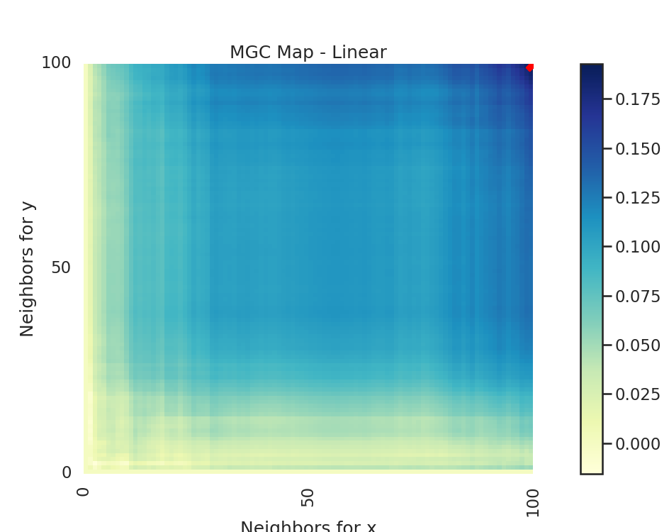
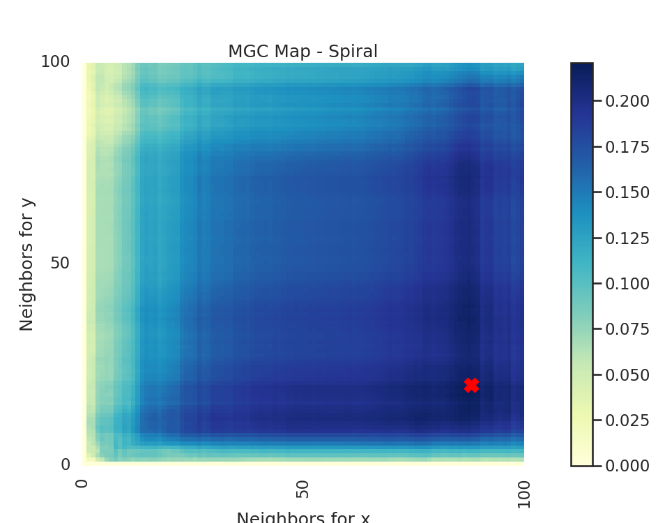
The MGC Map is essentially an array of local correlations (i.e. the test statistic that
at each nearest neighbor pair). The optimal scale is the nearest neighbor pair that
maximizes the test statistic, and this test statistic is the one we return as part of
MGC.
Let's look at how we can use hyppo
to find a trend in linear data sets (hyppo.tools.linear) and nonlinear data sets
(for example hyppo.tools.spiral) and visualize this map and optimal scale.
Out:
Optimal Scale: [100, 100]
Optimal Scale: [15, 82]
import matplotlib.pyplot as plt
import matplotlib.ticker as ticker
import seaborn as sns
from hyppo.independence import MGC
from hyppo.tools import linear, spiral

# make plots look pretty
sns.set(color_codes=True, style="white", context="talk", font_scale=1)

# make a dictionary that maps the simulation function to a string
sims = {
    "Linear": linear,
    "Spiral": spiral,
}


# make a function that runs the code depending on the simulation
def run_test(sim_type="Linear"):
    """Runs all the tests for both simulations."""

    # simulate our data (100 samples, 3 dimensions)
    x, y = sims[sim_type](n=100, p=3, noise=True)

    # calculate the MGC test statistic, p-value, and get a dictionary with the
    # mgc_map (shows the geometric nature of the relationship) and the optimal
    # scale, which is the k,l nearest neighbors that maximize the test statistic
    _, _, mgc_dict = MGC().test(x, y, reps=0)

    # plot the MGC map with a map of the local correlations (as mentioned before,
    # shows the geometric nature of the relationship), and the optimal scale,
    # which is the maximimum smoothed test statistic
    mgc_map = mgc_dict["mgc_map"]
    opt_scale = mgc_dict["opt_scale"]  # i.e. maximum smoothed test statistic
    print("Optimal Scale:", opt_scale)

    # create figure
    fig, (ax, cax) = plt.subplots(
        ncols=2, figsize=(9.45, 7.5), gridspec_kw={"width_ratios": [1, 0.05]}
    )

    # draw heatmap and colorbar
    ax = sns.heatmap(mgc_map, cmap="YlGnBu", ax=ax, cbar=False)
    fig.colorbar(ax.get_children()[0], cax=cax, orientation="vertical")
    ax.invert_yaxis()

    # optimal scale
    ax.scatter(opt_scale[1], opt_scale[0], marker="X", s=200, color="red")

    # make plots look nice
    ax.set_title("MGC Map - {}".format(sim_type))
    ax.xaxis.set_major_locator(ticker.MultipleLocator(10))
    ax.xaxis.set_major_formatter(ticker.ScalarFormatter())
    ax.yaxis.set_major_locator(ticker.MultipleLocator(10))
    ax.yaxis.set_major_formatter(ticker.ScalarFormatter())
    ax.set_xlabel("Neighbors for x")
    ax.set_ylabel("Neighbors for y")
    ax.set_xticks([0, 50, 100])
    ax.set_yticks([0, 50, 100])
    ax.xaxis.set_tick_params()
    ax.yaxis.set_tick_params()
    cax.xaxis.set_tick_params()
    cax.yaxis.set_tick_params()
    plt.show()


# run the created function for linear and spiral simulations. Notice how the
# MGC map looks different for a spiral simulation and linear simulation.
# Optimal scale informs this, linearly related data has a scale at the max
# scale, while nonlinearly related data does not.
run_test(sim_type="Linear")
run_test(sim_type="Spiral")
Total running time of the script: ( 0 minutes 0.396 seconds)